
That's right, kids. Pure and unadulterated knitting content and a few tips as well! I hope you come away feeling like you can push the envelope a bit.
After my Memorial Day moment of what-to-do-next-itis (don't tell me you don't get those or I'll slap ya), I started the commission sweater for Mila, a gal in my office who's expecting in November. She wanted a baby sweater but didn't know what the sex of her baby was and didn't want something that was particularly tied to the baby's sex. I finished the body of the sweater last night and I'm very pleased.
Now one of the things that I take into consideration when I do a commission is expense. It would be nice to take advantage of someone who tells me "Buy what you want to use!" and get some really spendy yarn that while it's incredibly soft would cost an arm and a leg to the client. I also like to play with color and the sweater I had chosen had a yoke with stranded colorwork in it. But the original pattern calls for 6 colors: the main color for the body and 5 for the yoke. Now if this was an adult sized sweater, it wouldn't have been any big deal to get the 5 colors. But a baby sweater? I didn't have scraps of DB Baby Cashmerino lying around. I would have to buy 5 skeins of yarn from which I would probably use 10 yards or so each. So I decided to change the yoke pattern to one that took 4 colors, including the main color. This worked out well and Mila was very pleased with the result.
There are times when you have such a situation. Say you want to make a pair of mittens for your niece and you have the yarn but only in 4 colors instead of the 7 that the pattern you picked calls for. You have a few options:
1. Bag the pattern and hunt for something else.
2. Go buy more yarn.
3. Change the colorwork design to use 4 colors instead of 7.
If you have oodles of money or the yarn wasn't that expensive, options 1 and 2 are viable options. But they don't give you a challenge that 3 does, nor do they make the item unique.
The tools you'll need are graph paper and coloring markers (if you can find one of those sets that has more than 28 colors, you're in good shape. Or get crayons.). If you buy graph paper, try to find the kind that is designed for knitters, not engineer's quadrille paper. Stitches tend to be tall and narrow, not square, and you want to be able to see your design as it would appear stitched up. What I do is use my spreadsheet program (I use MS Excel), take the blank grid and alter the cell sizes so that they resemble knitter's graph paper (I do a 2:3 ratio of width:height). I print out pages for playing around with designs.
The next thing is you want to take the pattern you have and figure out the repeat. In the pattern for Mila's sweater, the repeat for the yoke pattern was 12 stitches in a 15 row section. The pattern should show a graph of the motif you're doing with the repeat and the ending stitches. Mark that dimension out on your graph paper and add two repeats of that dimension. For Mila's sweater, that would be three sections of 12 columns and 15 rows one right after the other in a row.
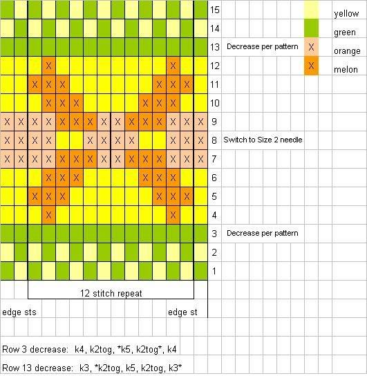
Look at the colors you have and see what colors pop out when put against the main color versus those that sort of hang back. For the sweater, the darker salmon color was the most vibrant against the green whereas the butter yellow nestled next to it comfortably. The yellow against the salmon also made the salmon color pop. So I opted to make my main motif the salmon color. Do the same with your colors. As a general rule, oranges and blues pop when placed against each other; so do violets and yellows together and reds and greens together (aha! Salmon Red against Sage Green!).
Now look at colors that like each other. In this case the green and yellow work well together. So do the yellow and orange and the orange and salmon. I could have put the salmon around as the border but then the stitch colors would be fighting each other and drawing the eye away from the main motif. Instead I placed the yellow, which gently draws the eye up to the yoke and toward the motif.
Shapes are another thing to consider. In stranded colorwork, the general rule is to not have more than 2 colors going in a row. You also don't want to have more than 5 stitches between color changes without doing something with the yarn floating on the back. In this motif, I've broken the stitch rule, having 6 and 8 stitch runs going between the arms of the salmon pattern. I could have woven the strand in the back of the motif but I've opted not to. I wouldn't have a long float if this was a sleeve but since this is a yoke on a sweater, I figure this won't be a problem as fingers won't be getting into the floats. But that is something to take into consideration, especially if you're not experienced in doing colorwork. Long floats tend to make the fabric tension difficult to maintain and easily snag.
There are sources of pattern motifs from books to websites. You can search them out, or you can play with simple motifs like X's or O's, zigzags, checkers, waves, or flowers. What you want to consider in your design are simplicity, continuity, and harmony. Start with a central motif as your focus first. In my case, it's a flower motif. Then consider what you want to have as the background of the flower. Do you want the flower to stand out vibrantly or gently? Then consider what you want as a border. You want a very simple motif for the border. For this pattern, I had to also consider the points where the yoke is decreasing. Those points I made in one color except for the one where I'm changing the needle size.
Fill in one repeat of your pattern in the center section of your graph. Then fill in the next repeats on each side. Set your graph paper where you can see it from a distance, like 5 or 6 feet. What's happening to the pattern? Is your motif staying the same or is it changing to a different pattern? Is that something you want? Play with another repeat. Is it doing what you want it to do? Don't be afraid to discard an idea for another. Sometimes it takes a few doings to find the right combination. If you're stuck, set it aside and go looking at sweaters and other items that have been done with stranded colorwork. Observe what the patterns are doing and how they happen. What colors are being used? How are they being placed? Why is a particular color being used in one place? What would happen if it was moved to a different row of stitches?
Any questions? I'll answer them in a future posting. I'll post an exercise as well on color placement.
4 comments:
Hey, Duffy, dear, nice teaching explanation! You describe this complex subject easily and make it sound fun. I enjoyed seeing how the ideas developed in your strategic mind. Thanks! I especially love the theory of complementary colors and how they pop, and the triadic or adjacent colors harmonize. You could be a good teacher, ya know? Have a great trip to Paradise...
Very well explained. You almost make me want to start knitting colourwork. Maybe I'll do some mittens in the fall (or given their size, they might be a good summer knitting project).
This website has a tool for printing knitters graph paper in the exact gauge of your project. It downloads it as a PDF to print. http://www.tata-tatao.to/knit/e-index.html
Duffy,see I do look at your blog. The sweater is going to be beautiful and I hope the mom will appreciate it. One thing, I have done is ask the person who wants something knitted to pick out the yarn with me. I'll have a few samples, along with price, from which they can pick. Oh another thing, I love your roses. Renate
It's lovely. For some reason, I had a hard time getting the photos to load. But nice choice of colors!
Post a Comment